Monday, December 3, 2018

Creating objects out of Word Art research


Images 1-3 source: Sri Lanka Tourism Campaign

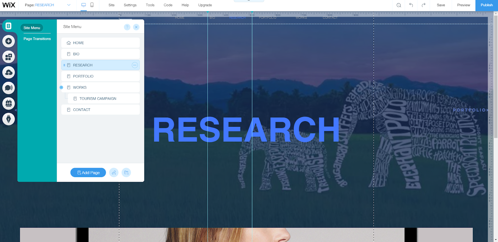
Through the tourism campaign for Sri Lanka, I was inspired to use the form of Word Art to create some objects that represent what you can do in Tanzania. The words used to create these objects imply what you can do in Sri Lanka. I was really fascinated by this form of advertisement. Therefore I did some more research on this technique.


Images 4-5 source: Word Art Research 1

Image 6 source: Word Art Research 2
Image 7 source: Word Art Research 3

In these objects and figures made out of word art, are all presented in a black and white contrast which makes the words much more clearer to read and see. This gave me an idea that I should do my drawings of word art with a black coloured pen on white paper then photoshop the figures into the background of the Images that I will be using from Pixabay, to make my words stand out and be readable. 

Research on Lonely Planet for Toursim


I decided to research on another tourism campaign for Tanzania to get more inspiration and more information about the most interesting places to visit in Tanzania. 

When I opened the lonely planet site I was attracted by the self-scrolling slideshow showcasing some of the beautiful places in Tanzania and in each slide there was a small information about Tanzania.
I really like how the small text about Tanzania is informative as well as interesting. This is one of the qualities of a good advertisement. I got inspired to also have a bit of information on my designs about Tanzania, to give an interesting small fact about the country on the advertisement poster. 
As I scrolled down the page I got more information about Tanzania and what makes this country stand out for tourism. By reading this now I definately know what are the four aspects will be represented on my four campaign posters. The most interesting places I think the tourists would like to see and I believe they will be attracted by ar the national parks, Mt. Kilimanjaro, Tanzania's beaches and cultures through Tanzania's products, I know this because looking at what was mentioned on the previous website (Tanzania Tourism Board) and this website (Lonely Planet). I agree with these websites because I am from Tanzania and I saw that many tourists were arriving in Tanzania because of these attracting places.

Saturday, December 1, 2018

Research on Tanzania Tourism Board.

When I searched tourism campaign for Tanzania on google, the first website resource that caught my eye was the Tanzania tourism board. This site had excellent imagery and tourist looking at this site would clearly understand what the point of this website is for and it is easy to navigate their pages and information. It had a language button on the top of their website, so that shows that they are looking at an international market/group of tourists and that was interesting to know.
As I scrolled through the website, I saw that there was a self-scrolling slideshow of some of the interesting places to visit in Tanzania with a bit of information. 

The images used look exotic and very attracting. Although, I think the should have edited the images a little bit more. 
When I hovered my mouse over on the places to go, I saw the different locations they have represented. For my tourism campaign, I looked at several of those places and decided to go with Kilimanjaro, Zanzibar and two national parks for my campaign posters. I will look through Pixabay for the images of the places so I could use them for my campaign poster.

Images 1-6 source:Tanzania Tourist Board

Second Improvement on my website (portfolio and contact page)

This is how my portfolio page looked like at first. When I was testing the gallery I saw that the images would not be completely displayed. Therefore, I had to change the gallery.
I changed the heading font to match the font of the other pages to keep a consistency. I also changed the gallery to the Magic gallery. I chose this gallery because I saw that the images were well displayed and none were cropped out. I used the blue lines and ruler to keep the same order and size throughout my website.
I tested how the page would look like through the mobile view and it looked just the way I wanted to look. Although there were no buttons because there was no space for them.
This is how my contact page looked before I edited it. It was disorganised and it had no alignment.

This is how the contact page looks like now. It looks much more aligned and neat. I also added a transparent dark blue background to make the text and heading standout more. 

I tested to see how my contact page would look like through mobile view and it looked perfect in how it was structured. Although, my portrait could not fit so I hid it.

Monday, November 26, 2018

Improvement on my Website


Today I got some feedback from one of my  Digital Arts' tutor. Therefore, today worked on improving my website. I improved my Bio description, changed my bio picture and fixed some errors on my contact page.

Wednesday, November 21, 2018

WEBSITE CREATION (works page)

I made the title vertical to match the home page title, to keep consistency in a way. I also used the same motion of animation and time duration as the home page's first heading.
I mad the second heading horizontal to be the same as the homepage headings. I wrote in the second heading works and research be cause I decide to connect my research with my work because research is what helped me and gave me inspiration to create my works. Therefore I deleted my research page because I realised that these two things cannot be separated with the help of my tutor of course.

WEBSITE CREATION (portfolio page)


I edited the Portfolio title so that it would move as all my other titles on my websites to keep the consistency. I used the same Fly-in motion as most of my other word animations.
I also used the same duration time of the other animations that I did, which is 1.6 seconds.
Later on I went to the add button and went to gallery to choose what gallery form I wanted to represent. I chose the Thumbnail (Pro Gallery) to represent my portfolio. The reason to why chose this gallery form because I wanted my viewers to be able to see my pieces properly and just swipe through easily to see the next image.


 I also added the an extra gallery just incase if I had any extra photos.