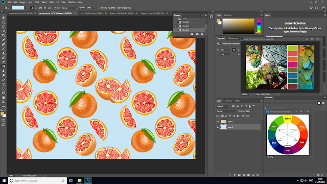
For 2 of my patterns, I did not create a repeated pattern out of them. The reason behind this because the whole repeated pattern would not look good inside the packaging mockup. The drawings would look small and unrecognisable. Therefore I decided to leave the pattern just the way it is in order that they would be large enough to stand out. After I was done colouring in the drawings I cleared the background with a magic eraser tool, so that I would be able to add another colour to the background.
 |
| Reference link |
 |
| Reference link |
I opened a new blank layer and used a gradient tool to colour in the background. I decided to first see how the yellow colour would look like as the background. Purple's complementary colour is yellow.
I did not like the background colour as much so I tried other colours to see what colour fitted best.
The pastel colour of orange seemed to fit perfectly and contrasted very well with the passionfruit drawings.
I did the same for the other patterns. I erased the background with a magic eraser and then I added the new layer and added a new background colour. I tested out several colours for the background to see what works better while following my tropical colour guide.
For the last two images, I just tested out one colour and saw that it worked perfectly so I left it as it is.


No comments:
Post a Comment