Wednesday, April 24, 2019

History of Soap

Soap Evolution/creation over time:

Soap has been around over the years in one form or the other. A site called (the soap kitchen) explains that soap that the use of soap dates back to 1000 B.C. However in those times they were not so pleasing to use as some soaps were made out of urine. From my understanding, I believe that soaps back then stank. However, through an evolution of soaps throughout time soaps were becoming developed. Although, around the 17th Century soaps still were unpleasant to use and were a bit harsh because they were made from caustic alkalies such as potash, leached from wood ashes and from carbonates from the ashes of plants or seaweed. Basically throughout all those years until the 18th Century soap was horrible. But then came a man with a solution, Nicholas Le Blanc, a Frenchman. Through him, soap until today has the same component which is sodium hydroxide. Sodium hydroxide is the base of most soaps today. After this discovery soap were continued to be developed in terms of shape and presentation. In the late 18th century, another innovation for soap was formed which was the "Transparent Soap", by Andrew Pears.
Pears
Even though it was an interesting innovation it was expensive to always buy since it would not last long as an opaque soap. Therefore opaque soaps were fonder. 

Soap Packaging Design:
Source:Pears

Source: Pears
The soap packaging back in the days for the Pear soaps were simple and had a distinctive font.
Source: pears
Even today's packaging design remains simple.


Tuesday, April 23, 2019

Major Project 2: initial Ideas and research

For my major project for this term, I will be creating a brand for soap and the advertisement for it.

This will include:
- 4 different designs for packaging for the 4 different types of soaps
-An advertisement poster for 2 types of soap (billboard, social media, billboard, etc.)

So far I have looked into soap brands such as Yardley, Lux and Dove. These were the main soap brands I used while growing up. I decided to create a branding and advertisement campaign for soap because of my interest in how a product's packaging can influence a customers attraction towards the product. I also chose soap instead of any other product because of how it is a necessity in life, and it dates back to years ago, so therefore I chose so I could research on the evolution of it.
Source: Yardley

Source: Lux

Source: Dove
The soap's packaging that I have shown in this blog gave me initial ideas of how soaps are branded and how the packaging is designed. The brand name of the soap is bold in every package in any type of soap package. The design on the package relates to what the soap consists of/ or the name of the soap. The packaging of the soap that stands out to me is the Lux's one because it has a lady on the package. The first thought that goes through my head when I saw this packaging design is that this soap was made only for women. But not just any type of women, women who want to smell luxurious or us luxurious soaps, because of the lady's pose and style.

With all of these thoughts about the lux design, I will be looking into why women are placed in some of the soap advertisement and packaging. I will be looking at the history of it and learn from it, with this research I will get an idea of how to create my designs.

Wednesday, February 27, 2019

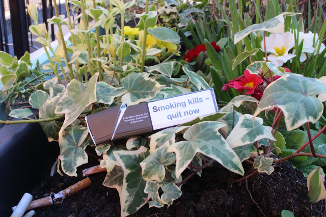
Photography exam

Task One:

ISO: 1600, F-Stop: f/5, Exposure time: 1/100 sec, WB: Auto

ISO: 800, F-stop: f/5, Exposure time: 1/80 sec WB: Tungsten light

ISO: 200, F-stop: f/5, exposure time: 1/800 sec WB: Shade
 Task 2:

Rule of Thirds
ISO: 1250, F-stop: f/5, Exposure time: 1/50 sec

Symmetry
ISO: 400, F-stop: f/5, Exposure time: 1/25 sec

Low Angle
ISO: 1250, F-stop: f/5, Exposure time: 1/60 sec

Focus on the Foreground
ISO: 400, F-stop: f/5, Exposure time: 1/25 sec
 Task 3:
F- 5.6
ISO: 100, F- stop: 4, Exposure time: 1/4000 sec

F11
ISO: 400, F-stop: f/11, Exposure time; 1/50 sec

F22
ISO: 1600, F-stop: f/22, Exposure time: 1/50 sec
 Task 4:
Fast shutter speed
ISO: 1600, F-stop: f/22, Exposure time: 1/30 sec

Slow shutter speed
 ISO: 100, F-stop: f/25, Exposure time: 2.5 sec


Sunday, February 10, 2019

Vintage Tourism Posters

I have looked at a couple of vintage tourism campaign posters to look at their techniques of illustrating a place to interest the public. I looked at their use of colour and how the sketch out the attractions.

SEE AMERICA tourism campaign posters illustrated by Alexander Dux:
These posters were designed for the United States Tourism Campaign during the 1930s. These posters were trying to promote tourism in the United States' national parks that is why all the posters feature landscapes and nature. 

Source: SEE AMERICA

Source: SEE AMERICA

Source: SEE AMERICA
As I look at these posters I can identify the trend that they carry. They all have a simplistic illustration. All these posters have only a few colours used and they are all mostly dull and dark colours. The "SEE AMERICA" title of the poster looks a bit different in each poster, but they are all in bold and their letters are spaced out to fill in the space in the bottom of the page. In all honesty, I personally do not like how these posters were made because of the dull colours, although I like the technique that Alexander dux used, which is the simplistic drawings. My favourite poster of the 'SEE AMERICA' series is the first one of the cave. I liked the way he used lighter and darker shades of blue to create a 3-dimensional  image, the style he used was Monochromatic. 

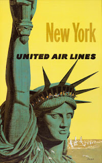
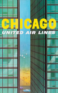
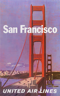
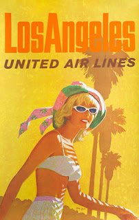
UNITED AIRLINES Campaign Posters by Stan Galli:
These series of United Airlines campaign posters for America were made in the 1950s. As I compare this style of illustration to Alexander Dux's style, Stan Galli's illustration in these posters is more vibrant. In the United Airlines campaign posters, Stan Galli uses mostly warm colours such as yellow, red, orange, red-violet, the only cool colours he uses are blue and green. Through the use of those colours, Galli expresses pleasant, mellow feels. These colours also give a feeling of summer vacation. 


Source for all the United Airline Posters: United Air Lines

What I have noticed about these posters is that the only thing that relates them together is the United Airlines heading, as it is the only that connects them because it is similar in each heading. Although, I think the use of bright colours connects them as well. I personally love Stan Galli's illustration's more because I am more attracted by the 'happy,' warm colours. When I will be designing my posters I will take in the idea of using vibrant colours especially since Egypt is a warm, pleasant place for a summer vacation.

Tuesday, February 5, 2019

ART PORTFOLIO MAJOR PROJECT TOURISM CAMPAIGN (what I will base my posters on)

I will create 8 different posters with different attractions on them. What I will keep constant is the logo, the style of font and phrase. The colours will be different and the attractions will also be different on each poster.

Inspiration:
Posters by Remko Heemskerk
The campaign posters the same font style and sort of the same style of sketching technique that links them all together. They have different scenes in each poster but they are all linked in the way they have the name of the place in bold and large.

Attractions I will be focusing my posters on:

ART PORTFOLIO MAJOR PROJECT TOURISM CAMPAIGN (initial/background research)

Ideas:
  •  For my tourism campaign for Egypt, I will be looking at different locations that may appeal tourists through some research on different sites that mention Egypt's attractions.
  • Then I will pick 8 top attractions/locations to create posters out of. And in the posters, I will try to implement the Egyptian cultures through colours and designs.

Initial Research ( Background research):
I have looked into a tourist board for Egypt and it explains what a tourist can do in Egypt. I was interested in how they used bright and big imagery and short bold phrases to grab the viewers attention. In their the tourist board site they give all the information about different locations and attractions any type of tourist could visit.
Source:  Egyptian Tourism Authority
Source:  Egyptian Tourism Authority

In the 'Where to Go' section, there are lists of different places where tourists can go visit. I will be looking into these places to see how I can give information about them in my posters.


Source:  Egyptian Tourism Authority

Source:  Egyptian Tourism Authority
 In the 'Experiences' section, it clearly shows what different types of tourist might be interested looking into. It shows that all types of tourists can find something to do and visit in Egypt. For example, a tourist that has a family can find family activities in Egypt.
Source:  Egyptian Tourism Authority
In the 'Stories' section, it has headlines of the interesting things about Egypt. I can look at these headlines to get an idea of how to create my logo for my posters.
Source:  Egyptian Tourism Authority

Source:  Egyptian Tourism Authority

Source:  Egyptian Tourism Authority

Source:  Egyptian Tourism Authority

Source:  Egyptian Tourism Authority

Source:  Egyptian Tourism Authority

Source:  Egyptian Tourism Authority

Source:  Egyptian Tourism Authority

Source:  Egyptian Tourism Authority

Source:  Egyptian Tourism Authority

Source:  Egyptian Tourism Authority 
Source:  Egyptian Tourism Authority