SEE AMERICA tourism campaign posters illustrated by Alexander Dux:
These posters were designed for the United States Tourism Campaign during the 1930s. These posters were trying to promote tourism in the United States' national parks that is why all the posters feature landscapes and nature.
 |
| Source: SEE AMERICA |
 |
| Source: SEE AMERICA |
 |
| Source: SEE AMERICA |
As I look at these posters I can identify the trend that they carry. They all have a simplistic illustration. All these posters have only a few colours used and they are all mostly dull and dark colours. The "SEE AMERICA" title of the poster looks a bit different in each poster, but they are all in bold and their letters are spaced out to fill in the space in the bottom of the page. In all honesty, I personally do not like how these posters were made because of the dull colours, although I like the technique that Alexander dux used, which is the simplistic drawings. My favourite poster of the 'SEE AMERICA' series is the first one of the cave. I liked the way he used lighter and darker shades of blue to create a 3-dimensional image, the style he used was Monochromatic.
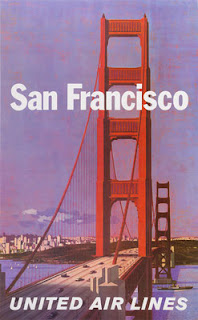
UNITED AIRLINES Campaign Posters by Stan Galli:
These series of United Airlines campaign posters for America were made in the 1950s. As I compare this style of illustration to Alexander Dux's style, Stan Galli's illustration in these posters is more vibrant. In the United Airlines campaign posters, Stan Galli uses mostly warm colours such as yellow, red, orange, red-violet, the only cool colours he uses are blue and green. Through the use of those colours, Galli expresses pleasant, mellow feels. These colours also give a feeling of summer vacation.


Source for all the United Airline Posters: United Air Lines
What I have noticed about these posters is that the only thing that relates them together is the United Airlines heading, as it is the only that connects them because it is similar in each heading. Although, I think the use of bright colours connects them as well. I personally love Stan Galli's illustration's more because I am more attracted by the 'happy,' warm colours. When I will be designing my posters I will take in the idea of using vibrant colours especially since Egypt is a warm, pleasant place for a summer vacation.
This is okay, but surely what else unites the United Airlines posters is the use of a similar striking font. You identify what is positive about Galli's poster design in terms of the colours used and how much more vibrant than Dux's use of colour that is. You draw good comparisons between both designers work. But did you think who they might be aimed at? Dux's work looks more epic or poetic (the use of high contrast and dramatic landscapes) and I think was aimed at the adventurous domestic or international traveller, Galli's looks more aimed at leisure and is perhaps for young couples/annual holidays.
ReplyDeleteI think another important element is the importance of the photographic image in both designers work, as the use of depth is fundamental and both seem to have derived their work from photographic source material. Galli uses familiar landmarks, famous the world over, Dux uses the American landscape.