Wednesday, November 21, 2018

WEBSITE CREATION (bio page)


At first my bio page was called introduction then later on I changed it to be called bio, because introduction did not really make sense if I was going to explain who I am on that page. I also got the idea to create a bio page from my research on Karen Arnott's website (https://karenarnott.co.uk/). I also decided to add a portrait photograph of myself, so that viewers would know who I am. I inserted the picture in the middle of the page and dragged the heading to the front.

Then I changed the button that said 'Work' to 'Bio', and it directs the viewers to my paragraph that explains who I am and what I am doing. 
 
I also changed the work button into the inspiration button, to make the viewer access the research page easier and that he/she could understand that the  research I have done is what inspired my compositions.
I also made the introduction page second on the list so that it would be the first thing the viewers would see before the would look at my works. I chose this arrangement, so that the viewers would first read what I do and what this web is for.

Wednesday, November 7, 2018

WEBSITE CREATION (homepage creation)


I decided to go with a  blue theme for my website, therefore I kept a dark blue geometric moving wallpaper and light blue text to contrast with the dark blue wallpaper. The reason why I went with the dark blue geometric wallpaper was to somehow portray graphic design and also because I like the colour. I decided to type in my text vertically to contrast the motion of the moving wallpaper that was going in a  horizontal motion.


I added a horizontal text explaining what the website is about. I decided to edit this text with another colour because I wanted it to stand out.

I also added an image that is an Anti- drug campaign poster that my team members and I made to add more to explain what this website is about.

DIGITAL ARTS MAJOR PROJECT PLAN


HERE IS MY MAJOR PROJECT PLAN !!!!


Sunday, November 4, 2018

WEBSITE RESEARCH


I looked at 2 different graphic designer's websites to learn from them how to present myself and my work on a website. One of the graphic designer's name is Karen Arnott and the other graphic designer is called Matt Hollands. After looking at both of their websites I got quite good idea how my website should turn out to be.

KAREN ARNOTT

1. HOME PAGE
source: https://karenarnott.co.uk/
In Karen Arnott's home page she displayed a picture of herself and had a heading of who she is and a small information of what she does. I like the the white and black theme she was going for and the grey filter for her portrait. I think her style of her website's home page is very well thought through, because once a person opens her website it clearly explains what the website is about.
2. PORTFOLIO
source: https://karenarnott.co.uk/
As I scrolled down her portfolio was attached to the homepage, although there was a separate page for her portfolio too. That did not make sense to me, perhaps she had nothing else to add to her homepage and did not want to leave it empty. However I liked the way she placed her work, it was very organised. For every type of design she placed them in a category and when you hovered your mouse over one of her images it would explain what the image is for.
source: https://karenarnott.co.uk/
OTHER SCREENSHOTS OF KAREN ARNOTT'S WEBSITE:


Overall, I like the way Karen Arnott displayed her work and explained who she is on her website. It was simple and easy to navigate where all the things were.

Matt Hollands

1. PORTFOLIO
source: https://www.matthollandsdesign.co.uk/#
In Matt Hollands website, he did not have a homepage he just started with his portfolio and I think that is not right because usually a professional website would have one. The fact that he put his logo on the website makes it seem somehow professional, and it also makes me make one of my own and add it to my website. Also, I like how the background  matches with his poster, makes the viewer understand what he is trying to represent.

When I pressed on the three dashes/menu bar, I did not like the way it cover the whole screen.
MENU BAR
I felt as though he could have represented it by covering a quarter of the website, it seemed not well thought out.

OTHER SCREENSHOTS OF MATT HOLLANDS' WEBSITE


REFLECTION:
As I looked at both of these websites I found Karen Arnott's website more organised and well detailed and easy to understand. When I looked at Matt Hollands it was a bit of dull and seemed it lack information because there were so many empty spaces. While I will be creating my website I  will be focusing on Karen Arnott's style, she will be my inspiration.

Saturday, October 27, 2018

Major Project (Initial Ideas)

BRAINSTORM
For my major project I decide to do a series of tourism campaign posters for Tanzania. My inspiration for tourism campaign as my major project comes from a Sri Lanka Tourism campaign by Visual Ashram. In one of their poster the formed elephants out of words that are (I am guessing) related to the things you can do in Sri Lanka. It was quite a unique poster and it inspired me to go with tourism campaign poster.

Sri Lanka tourism campaign poster
source: http://visualashram.com/Sri-Lanka-Tourism-Campaign

Anti-Drugs Campaign

Final Piece
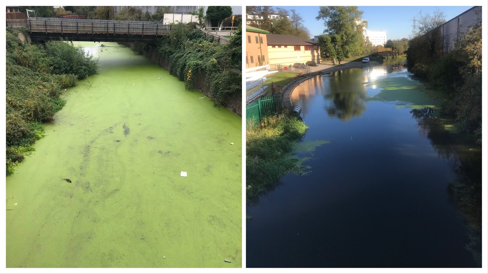
As you can see, the anti-drugs campaign poster is an incredible success.  Unfortunately, this campaign poster was not our first idea. My team (Patrikas and Guilherme) and I wanted to do an environmental campaign at first. We wanted to inform an audience about the pollution of the River Soar and convey a message that we should keep the river clean or else we would ruin the ecosystem of the swans. When we went down to the river channel next to LIDL to take some professional photographs with better angles of the polluted river channel by surprise we met a cleaned up river channel. Therefore our campaign poster could not work, we had a brilliant idea but no evidence of the pollution.
The river channel before on the left, the river channel after on the right.
Because of this disadvantage of the environmental campaign, my team and I decided to go with our 'plan B' idea for our campaign which was an Anti- drug campaign. Our reason to why we decided to make an Anti-drug campaign is because there are lots of young people getting under the influence of drugs. From our experience we have come across many young people who are dealing with drugs on frequent basis, therefore we know know it is a big issue that should be taken care of. Especially, in may case I lost a friend the beginning of this year due to the overdose of drugs. With all these aspects considered, my team and I wanted to make a powerful anti-drugs campaign.

Recently, a famous rapper named Mac Miller passed away due to drug overdose. He was just 26 years of age, he had so much more life to live through but he fell under the influence of drugs. My team members and I thought it would he would be a good example to show proof what drugs can do to a person which is dying young. Before using Mac Millers face for our campaign we decided to some market research to see whether a majority of the young adults audience knew who he was.
Market Research
Our team placed a photo of Mac Millers on to the board without his name. Then we asked our classmates to raise their hands up if they knew who this artist/rapper was and the majority raised their hands up. With this research my team and I knew that using him for our campaign poster was going to work out great. After our research, we started to brainstorm ideas for how to represent Mac Miller. Since he was dead we were brainstorming ideas on how to represent that on our campaign poster to imply a message that this what will happen with the use of drugs. We came up with idea to photoshop a half of a skull onto a side of his face.
Mac Miller: the photo we used for our campaign poster
Source: http://www.vulture.com/2018/09/mac-miller-profile.html
 
The Skull: we used the right side of the skull to photoshop it into Mac Miller's face
Source: https://boneclones.com/product/human-male-european-skull-BC-107


With these two images presented above we formed our image for our campaign poster.


After Patrikas photoshopped Mac Miller's face with a photoshop app called pixelmator we did some research on different anti-drugs tag-lines to get some ideas so that we could we could create our own.
g
This was the site that we used to get some ideas for our tagline.
Source: https://brandongaille.com/61-catchy-just-say-no-to-drugs-slogans/

After our research, we came up with our own initial tagline idea "Don't take drugs, Don't die young." However, after some deep thought about our initial tagline idea we realised it was not a powerful one. We needed a powerful, shorter, powerful tagline. Because of this, we thought of reverse psychology.
"Reverse psychology is more likely to be successful with people who have a high need for control. Rebellious teenagers who naturally do the opposite of what their parents say are classic targets, as are Type A people and those with narcissistic or even psychopathic tendencies"- changingminds.org. As a result of usually telling young adults not to do something and they would always do the opposite, we decided to come up with a tagline that tells them to do drugs. Our final idea for our tagline became "Take drugs, Die young."
Research for a powerful quote by Mac Miller that relates to our poster idea
Source: https://wealthygorilla.com/15-inspirational-mac-miller-quotes-from-his-lyrics/
To make our campaign poster even more striking we decided to add one of his quotes. We did research through the web browser for quotes that relate to the fact that he did not want to die young. The quote we decided was strong  and ended up adding to our campaign poster was, "Never scared of death, but I ain't ready for that day to come." The reason we chose the bold colours orange and yellow for the text was for the words to stand out. We used a slightly darker shade of orange for the tagline so that it would give sort of a warning message.

In conclusion, I think my team and I did our best to present this poster in a powerful way. I like the fact we had a good thought process throughout the whole project, we all shared and combined our ideas to form this poster. Patrikas was in charge mostly in the photoshop part of the project and Guilherme and I were mostly the ones doing the researching and coming with tagline and the searching for a powerful quote.


Monday, October 22, 2018

Initial Website Design

Today, I started to use Wix to design my website. So far I have been able to design parts of my template, edit the background and the fonts in class. There is so much more to work, on as I will have to insert my own image and the edit the backgrounds a bit more. I will work on it this week and make it interesting.