Monday, June 3, 2019

Research for Advertisement

I have decided to design also the advertisement for the soap. I want to create billboard advertisements, bus stand advertisements and advertisements that are on buses. For this, I had to research to see how these types of advertisements look and see how I can create them.
reference link

Reference link
From what I have noticed from these two advertisements that are on the buses is that they contain very little information that is effective. This is probably because of space isn't enough and since it is on a bus it needs to be large enough for the people to see from far away. What I have noticed is the brand name, the logo and the small information about the product or business is on the bus, as well as an image of a person. That gives me an idea of what should be on my bus advertisements. 
reference link


reference link

Reference link
The images above are of the billboard advertisements for the soap lux. What I have noticed about these advertisements is that they have much less wording and more imagery on them. I believe this because of the idea of it the other information if kept on the advertisement poster would not be visible or if they were made larger to be seen it would look so clustered and not pleasing to look at. Not only does our brain process visual information so much more effectively than text, visuals are simply more persuasive (Parsons, 2018).” This quote explains to me why there is more imagery in the advertisement, this because of the fact that imagery is more effective and speaks more than words.
reference link

I have also looked at the advertisement poster for dove bar soap. Here they have an image and a tagline that relates to the image of the girls hugging each other. The advertisement contains the logo/name of the brand at the top right corner of the advertisement and the packaging of the soap and the bar soap itself on the bottom right of the advertisement. As I can see,  this advertisement is simple but is consistent and everything links together the imagery,  the tagline and the packaging of the soap. This gives me an idea of how my advertisements for my soaps should look like. And it also give me an idea of what my tagline should be about, it should link with the idea I am trying to sell.


The images above without referencing links are of the photographs I took from walking around the city centre in Leicester. I went to bus stops and studied the advertisements that were out there and I also looked at the advertisements that were on the buses that passed by.  The bus stop advertisements had a lot of information compared to the advertisements on the buses. I believe this because people can approach closer to the advertisements that are on the bus stops but the buses are moving so they need more imagery and few words that are bold and large enough to read from far.


Inserting designs into Packaging Mockup


From the image above you can see the striking differences between women’s and men’s razor. The women’s razor is on the left and men’s razor is on the right. When I look at the women’s razor I can see the bright colours of light green and light blue with a contrasting purple colour. While the men’s packaging has more of the darker colours such as grey, black and dark blue. The women’s packaging of the razor has letters which are curved and flowing. The men’s packaging letters are bolder and larger. They looking bulky rather than curvy. This shows me what the stereotypes about men and women are. Women are defined as curvy and men are described as bulky. For my major project what interests me is to focus on brighter colours and designs that attract women, especially since I am a woman and I use these types of products. I will address my designs to target women because of brighter colours I will be using as well as the curvy typography.

I decided to look at what curvy fonts were on photoshop so that I could use one of them for my packaging design.

Out of the 5 different fonts I personally liked Edwardian Script ITC. It looked elegant and it was very curvey. I also chose the name Revive as my brand name. The reason behind it is because I wanted to portray the soaps as refreshing, especially since they were of tropical scents.  When I think about a tropical place I think of it as refreshing and natural. So, therefore, I chose to use "Revive" as the brand name meaning the soap is bringing a person back to life and refreshes them.

I inserted my designs into the layers for the packaging box mockup. I also enlarged the design of the pattern in order that it would be spacious and large enough to be very noticeable.

Then I added a rectangular box into the design for the Brand name and the soap scent so that they would stand out. Because from my research I noticed that the wording on the packaging design should have space all around it. I believe this because it makes it easier to see and read the words.
I used a ruler guide on photoshop because I wanted my package design to be almost symmetrical when it comes to the designing of the information of the soap. I wanted it to be neat and organized.

This is the layer that enables me to put a design into the soap itself.

In this layer, I kept the name of the brand and a line stroke which is part of the brand. Because what I have learnt from my research about the packaging designs and soap is that consistency is key. 
I used a Google QR code generator to add create a QR code for my packaging design.

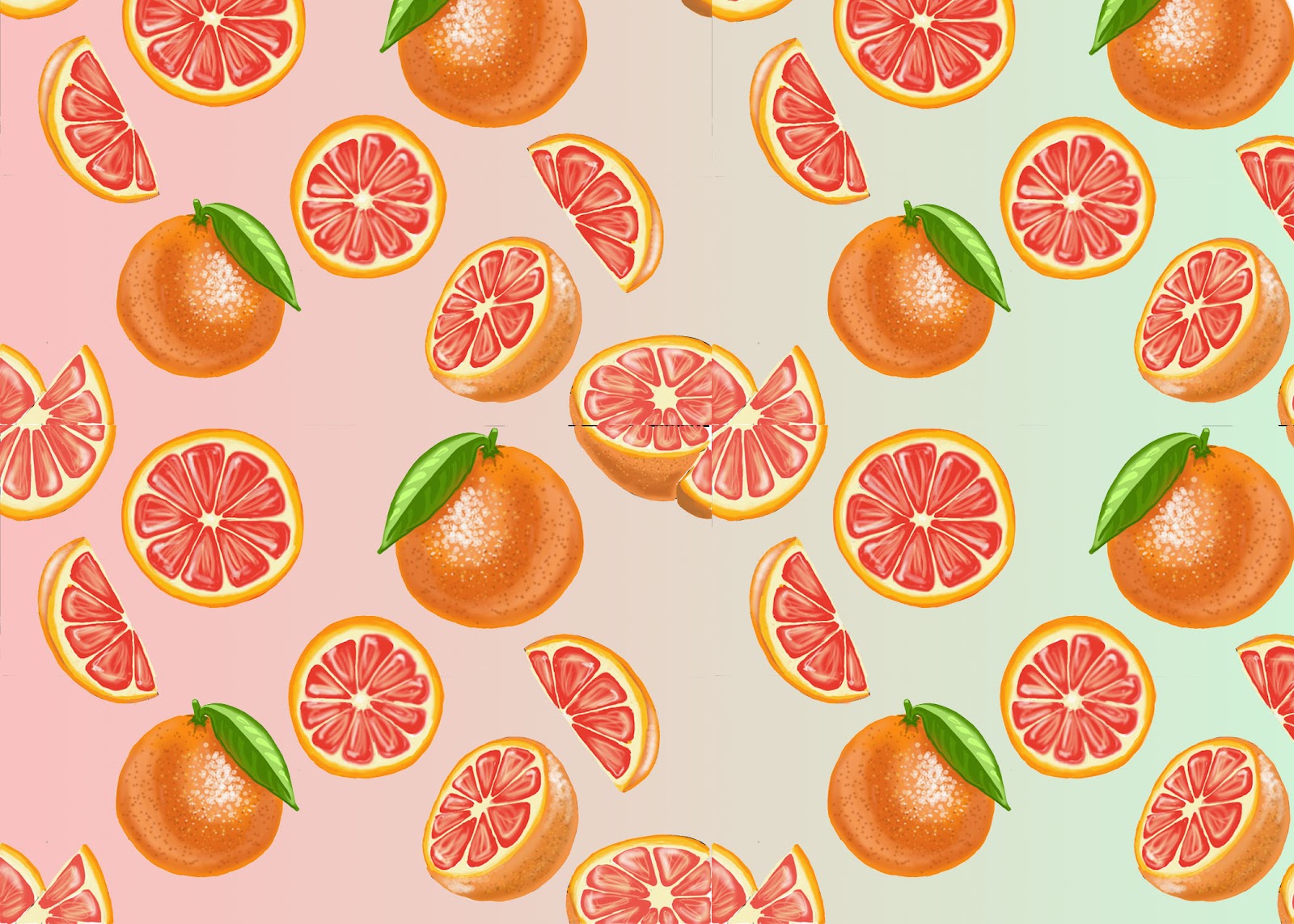
Here is how the design looks like with my passionfruit pattern design and the information. 

After I was done with editing the package box. I started to edit the soap as well. I change the colour of the soap in order for it to match the colour of the passionfruit.

After I was done designing the packaging box and the soap. I edited the background of the soap and the package box. I wanted to make the package box a soap to stand out so therefore I was trying out different colours that would compliment the package box and the soap.
I ended up choosing this colour for the background. I chose it because it really contrasted very well with the objects.

I used the same process for the other designs of the packaging. I made the brand name of the packaging small and the name of the soap scent larger. I did this because I wanted to deliver the information of what the soap is first then the brand as the second thought. However, what changed from my designs from the passionfruit to the Plumeria and Hibiscus packaging designs is that I outlined the box so that it would stand out more rather than mix up with the background.


Background Creation for Patterns


For 2 of my patterns, I did not create a repeated pattern out of them. The reason behind this because the whole repeated pattern would not look good inside the packaging mockup. The drawings would look small and unrecognisable. Therefore I decided to leave the pattern just the way it is in order that they would be large enough to stand out. After I was done colouring in the drawings I cleared the background with a magic eraser tool, so that I would be able to add another colour to the background.
Reference link
I got the image above to see what colours compliment with each other in order to have a contrast between my drawings and the background.

Reference link
The image above shows the types of tropical colours I will be using for the background. Since my soap scents are tropical I decided to use tropical colours to give that idea as well.


I opened a new blank layer and used a gradient tool to colour in the background. I decided to first see how the yellow colour would look like as the background. Purple's complementary colour is yellow.
I did not like the background colour as much so I tried other colours to see what colour fitted best.


The pastel colour of orange seemed to fit perfectly and contrasted very well with the passionfruit drawings.
I did the same for the other patterns. I erased the background with a magic eraser and then I added the new layer and added a new background colour. I tested out several colours for the background to see what works better while following my tropical colour guide. 


For the last two images, I just tested out one colour and saw that it worked perfectly so I left it as it is.


Sunday, June 2, 2019

Plumeria Pattern Design Process on Photoshop

The image above is what I used as a reference image for my drawings so I could get the right colours for the flower.

I started by outlining the plumeria flower then I added the colours in with a paintbrush while using a Wacom pen and a Wacom screen. Just like the drawing of the grapefruits in photoshop the plumeria flowers were created in the same way through the layer of different colour of oranges and yellows and through the use of different brushes available on photoshop. 

After I was done with the drawing I used a magic eraser tool to erase the white background. As I did so, unfortunately, some of the plumeria flowers were erased on the insides.


I decided then to take choose an orange hue and use the "Kyle Ultimate Thick n Thin" brush to outline the plumeria flowers so that they wouldn’t get erased the next time I used the magic eraser tool.


This is how the plumeria flower pattern looked aftward when I was completely done designing it.


Paying Attention to packaging design sizes and information

I have decided to do further research and look at different soap packaging designs. I wanted to pay attention to their sizes of fonts and drawings and how they work together. I also wanted to see what information is kept onto the soap packages.

Fig.1
What I have noticed from figure 1 is that the design doesn’t have a lot going on. It has a simple design but is still attractive to look at. The name of the soap brand is larger in comparison to the name of the type of soap scent. What I have also noticed from the packaging design is that the brand's logo is also on the soap. It shows me consistency. 3 things that I have learnt from this figure is that the name of the soap brand and the scent of the soap and some type of information of the soap should be on the front side of the package. For example, the name of the soap brand is "Chilly b," the scent of the soap is "grapefruit and poppyseed," and the information about the soap is that it is 100 per cent natural.


Fig.2

From figure 2, I have noticed it has quite less information compared to figure one. From my viewpoint, I cannot even tell what the product is about. It does not even state that it is a soap, I think this is a poor representation of what packaging design should be like. The packaging design should be more informative about what the product is about. But what has grabbed my attention from the designs from figure 2 is that the drawings are larger enough to fill out the whole space, they aren't clustered designs, they are more spacious. This gives room to the wording of the packaging to be seen, although the wording of the packaging is also helped to be seen by the strip that is behind them in order to make them stand out even more.


Figure 3, shows my how the drawings a much larger than the name and the information of the soap. This time the scent of the soap is what stands out and the brand name or logo is smaller than the name of the scent. From my viewpoint, I think this is a good representation of how packaging should be like. There is information about the soap which is "350g 12 oz," there is the brand name/logo at the top of the rectangle and there is the soap scent name in the middle and it also gives information that the product is a soap by the phrase "Moisturising soap".
Reference link

The image above is of a screenshot I have taken from a website that was giving examples and information about how packaging designs should be and what stood out to me is that the fact it mentioned that designs should be clear about the product. So, therefore, my designs should be clear about the product by giving information about the product is and its scent, etc.


Trying out Packaging Mockup

I decided to try out my design of the grapefruit pattern on the soap packaging mockup to see how it would look like. To see if the proportions were alright and if the grapefruits were easily noticeable.
Free Soap Packaging Mockup from online
The image above shows the pattern design I have decided to input into the mockup. 
The image above shows the different layers the mockup has. There's a layer for editing the soap itself, editing the soap packaging box and the background. To insert my design I had to open the package box and soap to see its layers and double click on them to insert the designs into the layers.  
Then after I added all the design to the sides of the packaging box, I edited the background and the soap colour. 


I added in the brand name of the soap into the front cover of the packaging box so get a feel of how it would look like. I wanted to see if the drawings in the background were the perfect size in order to not completely divert the viewers from the packaging brand name and the name of the soap. What I noticed was that the grapefruits were a bit too small. For my actual package designs, the drawings should become more enlarged and have more space between themselves.