Monday, June 3, 2019

Reflection and final designs


The images above are of the final soap packaging and advertisement designs that I have created. I have created 4 packaging designs and 3 advertisement posters.

Reflection:
I think I could have done a much better and more in-depth analysis of the research if I had more time. Throughout this major project, I had other assessments to work on so, therefore, I did not put enough effort into my research. I also struggled with time management and I did not keep track to with my major project plan. However, through this project, I have learnt how to use a Wacom platform to create my designs and I learnt how imagery is very essential in packaging and advertisement. I also learnt how to create a packaging design that is targeted for women by the types of colours I use and the fonts. For example, the colours you would see in most feminine packages is pastel or bright colours and the type of fonts you would see are curvey fonts. Curvey fonts are used to imitate a woman curvy shape. I have learnt that curvy fonts imply feminine qualities, therefore, they are used in most packaging designs that are for women.  While designing the patterns on photoshop on a Wacom platform, it did not occur to me that it will take a lot of time. For most of my project, I think the creation of the pattern was the hardest for me, especially since it was my first doing it. All in all, I am impressed with the designs I have created in the time that I had.

Advertisement Design Process

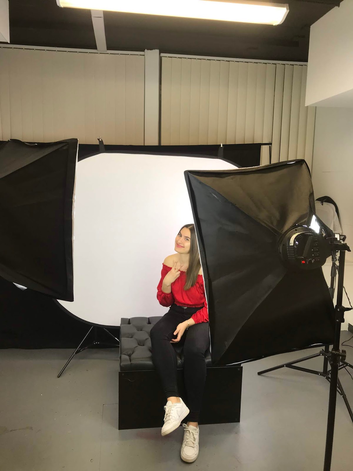
For my advertisement designs, I needed to insert images of a woman into my designs in order to illustrate that soap is meant for women. So I asked one of my female friends to model for me.


Before my friend started to model, I had to pick out the clothes she would wear for the photoshoot. Because I wanted her tow were clothes that match the packaging design colour. I ended up picking the yellow and the red top for the photo shoot.

I used a D700 canon camera to take the photos of my friend and I also used a photo studio to take photographs in. Since I have been taking Photography classes I was able to take perfect shots of my classmate.

I used a white background and white lighting. I used a white background so that it would be easier for me to crop her body out with a "magic eraser" tool on Photoshop. I used the white lighting in order to get all facial features seen in high quality because from my advertisement research I have noticed that the photographs of the models are always represented with a high quality of visibility.
After I cropped out the body of my classmate from the white background, I moved her body onto the free mockup template for bus stop advertisement. The Mockup had a layer where I could input my designs. I placed my model, the soap package design and soap into the poster. At the top, I placed the brand name and the line underneath the brand name. Underneath the line, I put the description "Bar Soap". I kept the font of the brand name and the design of the line underneath the brand name consistent to link the advertisement to the packaging design of the soap. I decided to use a pink background in order to contrast with model and the packaging design.

I used a tagline "Refresh Yourself," to illustrate the idea that soap refreshes a person when they use it. I also added a bit of information about the soap brand. In the bottom right corner, I added a QR code and the bottom middle of the poster I added the website link.  I did this in order for the target group can easily get more information.

This how the design looks on the bus stand.

For my second bus stand advertisement, there was a lot more space since it was rectangular. So for this advertisement, I made the image of the model larger. I used a gradient tool for the background. I used the colour pink as well for the background as well.

I then added the image of model.

Then I added the packaging design and the soap onto the poster. I placed them on top of the model's hand. I wanted it to seems as though she was representing the soap.

I added the same information as the first bus stop advertisement.

This how the second bus advertisements looks like.

For my third advertisement, I used a bus mockup.

I had to make my image of my model fit into the black rectangles. If there are in the white the image would not be seen.

For the bus advertisement, I added little information because there was not enough space and I need the wording to be large enough.


Major Project Plan


 .


Research for Advertisement

I have decided to design also the advertisement for the soap. I want to create billboard advertisements, bus stand advertisements and advertisements that are on buses. For this, I had to research to see how these types of advertisements look and see how I can create them.
reference link

Reference link
From what I have noticed from these two advertisements that are on the buses is that they contain very little information that is effective. This is probably because of space isn't enough and since it is on a bus it needs to be large enough for the people to see from far away. What I have noticed is the brand name, the logo and the small information about the product or business is on the bus, as well as an image of a person. That gives me an idea of what should be on my bus advertisements. 
reference link


reference link

Reference link
The images above are of the billboard advertisements for the soap lux. What I have noticed about these advertisements is that they have much less wording and more imagery on them. I believe this because of the idea of it the other information if kept on the advertisement poster would not be visible or if they were made larger to be seen it would look so clustered and not pleasing to look at. Not only does our brain process visual information so much more effectively than text, visuals are simply more persuasive (Parsons, 2018).” This quote explains to me why there is more imagery in the advertisement, this because of the fact that imagery is more effective and speaks more than words.
reference link

I have also looked at the advertisement poster for dove bar soap. Here they have an image and a tagline that relates to the image of the girls hugging each other. The advertisement contains the logo/name of the brand at the top right corner of the advertisement and the packaging of the soap and the bar soap itself on the bottom right of the advertisement. As I can see,  this advertisement is simple but is consistent and everything links together the imagery,  the tagline and the packaging of the soap. This gives me an idea of how my advertisements for my soaps should look like. And it also give me an idea of what my tagline should be about, it should link with the idea I am trying to sell.


The images above without referencing links are of the photographs I took from walking around the city centre in Leicester. I went to bus stops and studied the advertisements that were out there and I also looked at the advertisements that were on the buses that passed by.  The bus stop advertisements had a lot of information compared to the advertisements on the buses. I believe this because people can approach closer to the advertisements that are on the bus stops but the buses are moving so they need more imagery and few words that are bold and large enough to read from far.


Inserting designs into Packaging Mockup


From the image above you can see the striking differences between women’s and men’s razor. The women’s razor is on the left and men’s razor is on the right. When I look at the women’s razor I can see the bright colours of light green and light blue with a contrasting purple colour. While the men’s packaging has more of the darker colours such as grey, black and dark blue. The women’s packaging of the razor has letters which are curved and flowing. The men’s packaging letters are bolder and larger. They looking bulky rather than curvy. This shows me what the stereotypes about men and women are. Women are defined as curvy and men are described as bulky. For my major project what interests me is to focus on brighter colours and designs that attract women, especially since I am a woman and I use these types of products. I will address my designs to target women because of brighter colours I will be using as well as the curvy typography.

I decided to look at what curvy fonts were on photoshop so that I could use one of them for my packaging design.

Out of the 5 different fonts I personally liked Edwardian Script ITC. It looked elegant and it was very curvey. I also chose the name Revive as my brand name. The reason behind it is because I wanted to portray the soaps as refreshing, especially since they were of tropical scents.  When I think about a tropical place I think of it as refreshing and natural. So, therefore, I chose to use "Revive" as the brand name meaning the soap is bringing a person back to life and refreshes them.

I inserted my designs into the layers for the packaging box mockup. I also enlarged the design of the pattern in order that it would be spacious and large enough to be very noticeable.

Then I added a rectangular box into the design for the Brand name and the soap scent so that they would stand out. Because from my research I noticed that the wording on the packaging design should have space all around it. I believe this because it makes it easier to see and read the words.
I used a ruler guide on photoshop because I wanted my package design to be almost symmetrical when it comes to the designing of the information of the soap. I wanted it to be neat and organized.

This is the layer that enables me to put a design into the soap itself.

In this layer, I kept the name of the brand and a line stroke which is part of the brand. Because what I have learnt from my research about the packaging designs and soap is that consistency is key. 
I used a Google QR code generator to add create a QR code for my packaging design.

Here is how the design looks like with my passionfruit pattern design and the information. 

After I was done with editing the package box. I started to edit the soap as well. I change the colour of the soap in order for it to match the colour of the passionfruit.

After I was done designing the packaging box and the soap. I edited the background of the soap and the package box. I wanted to make the package box a soap to stand out so therefore I was trying out different colours that would compliment the package box and the soap.
I ended up choosing this colour for the background. I chose it because it really contrasted very well with the objects.

I used the same process for the other designs of the packaging. I made the brand name of the packaging small and the name of the soap scent larger. I did this because I wanted to deliver the information of what the soap is first then the brand as the second thought. However, what changed from my designs from the passionfruit to the Plumeria and Hibiscus packaging designs is that I outlined the box so that it would stand out more rather than mix up with the background.