I looked at 2 different graphic designer's websites to learn from them how to present myself and my work on a website. One of the graphic designer's name is Karen Arnott and the other graphic designer is called Matt Hollands. After looking at both of their websites I got quite good idea how my website should turn out to be.
KAREN ARNOTT
 |
1. HOME PAGE
source: https://karenarnott.co.uk/
|
In Karen Arnott's home page she displayed a picture of herself and had a heading of who she is and a small information of what she does. I like the the white and black theme she was going for and the grey filter for her portrait. I think her style of her website's home page is very well thought through, because once a person opens her website it clearly explains what the website is about.
 |
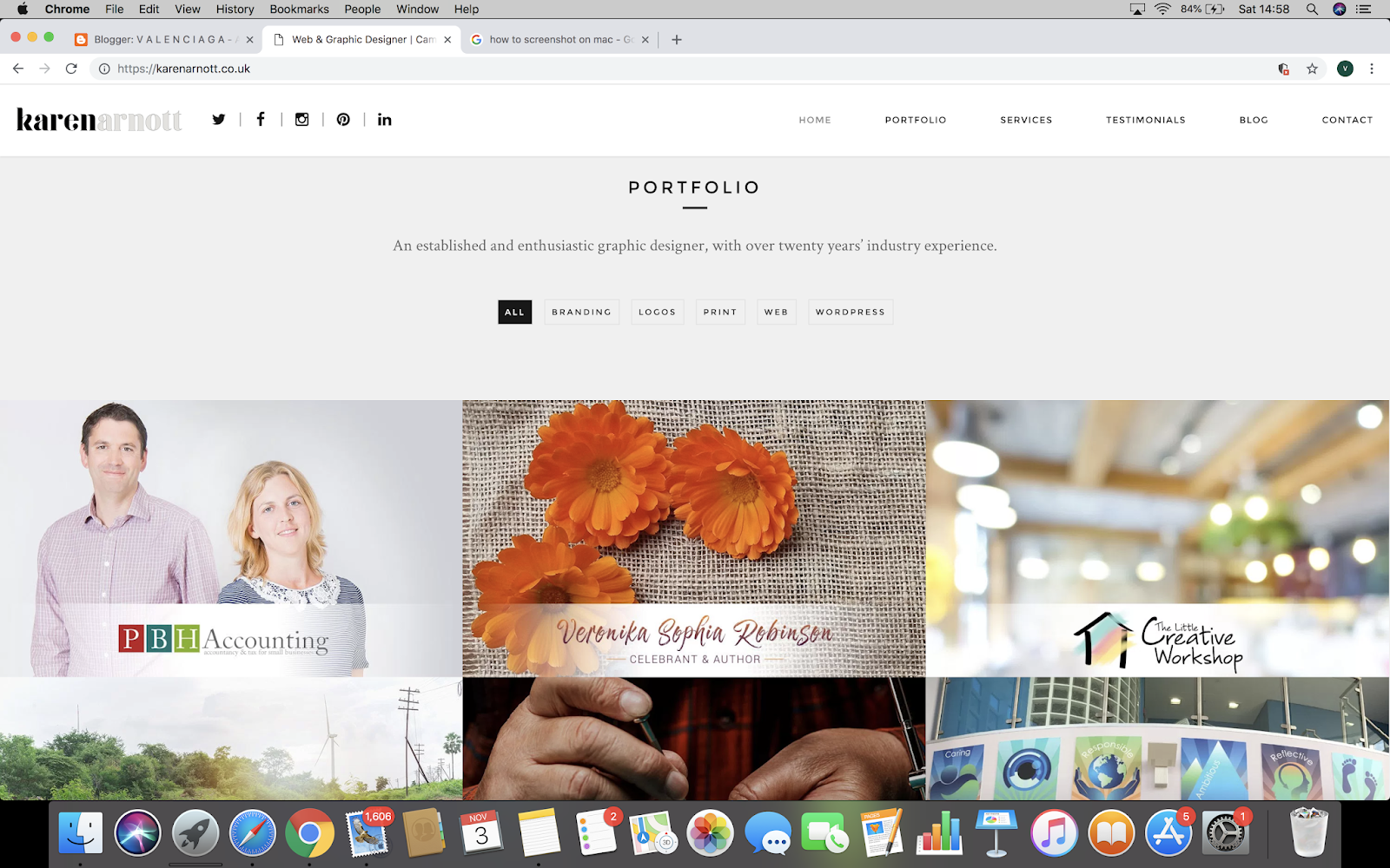
2. PORTFOLIO
source: https://karenarnott.co.uk/ |
As I scrolled down her portfolio was attached to the homepage, although there was a separate page for her portfolio too. That did not make sense to me, perhaps she had nothing else to add to her homepage and did not want to leave it empty. However I liked the way she placed her work, it was very organised. For every type of design she placed them in a category and when you hovered your mouse over one of her images it would explain what the image is for.
 |
| source: https://karenarnott.co.uk/ |
OTHER SCREENSHOTS OF KAREN ARNOTT'S WEBSITE:


Overall, I like the way Karen Arnott displayed her work and explained who she is on her website. It was simple and easy to navigate where all the things were.
Matt Hollands
 |
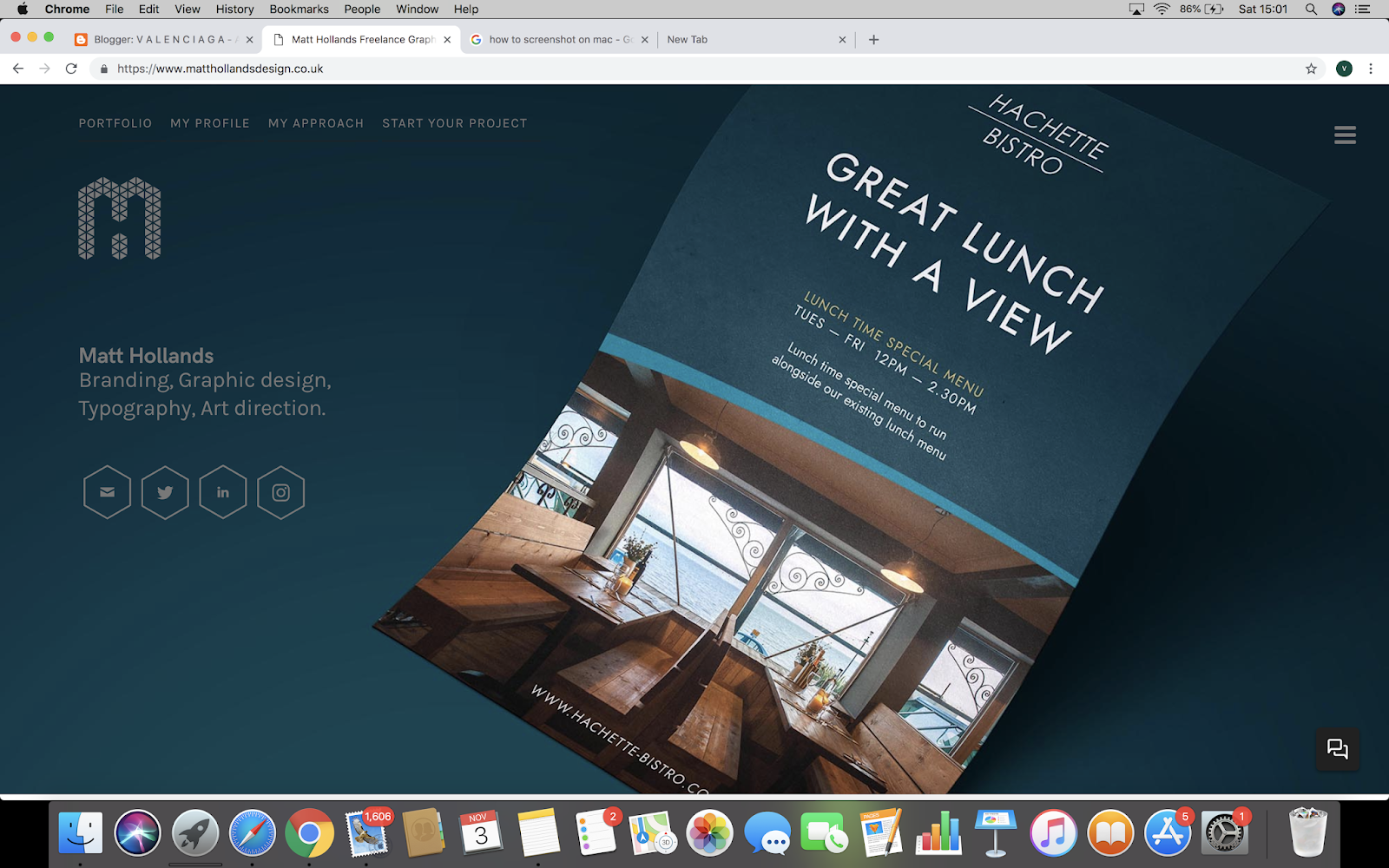
1. PORTFOLIO
source: https://www.matthollandsdesign.co.uk/# |
In Matt Hollands website, he did not have a homepage he just started with his portfolio and I think that is not right because usually a professional website would have one. The fact that he put his logo on the website makes it seem somehow professional, and it also makes me make one of my own and add it to my website. Also, I like how the background matches with his poster, makes the viewer understand what he is trying to represent.
When I pressed on the three dashes/menu bar, I did not like the way it cover the whole screen.
 |
| MENU BAR |
I felt as though he could have represented it by covering a quarter of the website, it seemed not well thought out.
OTHER SCREENSHOTS OF MATT HOLLANDS' WEBSITE
REFLECTION:
As I looked at both of these websites I found Karen Arnott's website more organised and well detailed and easy to understand. When I looked at Matt Hollands it was a bit of dull and seemed it lack information because there were so many empty spaces. While I will be creating my website I will be focusing on Karen Arnott's style, she will be my inspiration.


