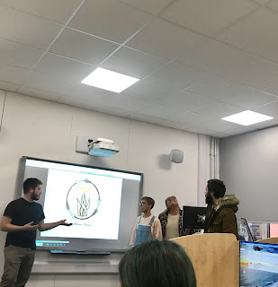
This week we had to present our advertisements and explain how we created it. It was interesting to hear and see other groups projects. Every single one of the groups came up with unique ideas for their advertisements or their campaigns. There was a colour pencils advertisement, a sleep mask advertisement, and an anti-gaming campaign.
 |
Color pencils advertisement
source: https://wonderandmadcheshir.blogspot.com/2018/10/hi-wonders-its-just-that-tomorrow-i-was.html
|
I really liked the way the colour pencils advertisement group worked together. Each member of the team had their own role into creating their advertisement. I also liked the way they made their poster look interesting even though the did not use photoshop to make their advertisement look engaging. The other thing that I found interesting about their poster was the contrast between the overhead image and the bottom image. I would say that they had a very good thought process. Although, I would like to mention that should have had more insight towards their ideas for their tag-lines. The team should have done more research to get ideas. However, during their presentation I could see that they really worked hard and put effort into creating their poster and they taught me that you do not need photoshop to make a great interesting poster.
Sleep mask advertisement
source:https://arkadkow.blogspot.com/2018/10/product-design-part-v-final-outcome.html
This group was very organised with the way the showed their work process and how they came up with their advertisement idea. They were also blessed to have someone who was skilful with photoshop. Although, I did not see much of their research done, they should have shown more of research and explain their editing process during their presentation. I really like their logo and their thought process on how they decided to create it. In conclusion, this advertisement team had a good thought process going on and were really creative with how the designed their poster to convey their message.
 |
Anti-gaming campaign
source: https://ricardocfantunes.blogspot.com/2018/10/blog-post_17.html
|
Out of all of the advertisement and campaign posters I really liked the anti-gaming campaign. It was so interesting how they came up with their image for their poster. The game lives, the time and the game controller fading away is a very striking image. You can clearly identify what idea this campaign poster is trying to imply. During their presentation the team should have been more enthusiastic when they were presenting their poster because it is quite a powerful piece. However, the poster's text should have been edited a little bit more to making it a striking tagline. The other fact that I liked about this groups presentations is that they made an effort to explain how the photoshopped and edited this piece.


Thanks Valencia. Please do continue with your thoughts and reflections on the presentations. Perhaps talk a little about how the presentations improved and what you learnt about your own personal ('soft') skills?
ReplyDelete